12 Best Website Design for 2018!
By: Anas Aldera, September 22, 2017
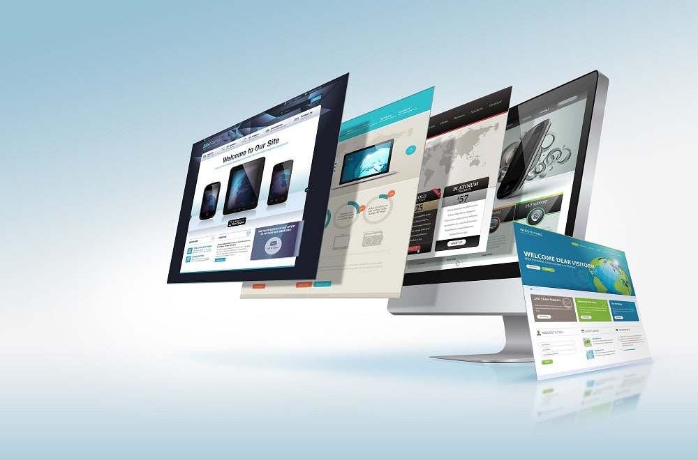
It is amazing how technology evolves and how what comes out of it can change overnight. The landscape of best website design is one such field that evolves faster than the human mind can comprehend. What looks modern and fresh today may be outdated tomorrow. This is why we have outlined a list of 12 rends you need to watch out in 2018. Make sure they inspire you to change your web design and SEO projects and be part of the movement this year.
1- Bright Gradients
Kaleidoscopic gradients are making quite a comeback. Y7K, a Zurich-based agency has illustrated how designers can make this two-tone effect look modern and fresh. He shows how full-screen, gradient-washed homepage can be outstanding on a website.
2- Duotone
For a cool and contemporary look, designers have adopted the pared-down, two-tone color schemes. A good example of what this new trend is all about, check out the example from Australian Design Radio.
3- Mixing Horizontal and Vertical Text
For a refreshing dimension, designers now free text from the usual horizontal alignment and placing them vertically. Director Matt Porterfield shows you how simple a site looks when horizontal and vertical text alignments are added on a page.
4- Geometric Shapes and Patterns
Websites today have embraced whimsical shapes and patterns to give life to sites with a flat and material design. There are some daring, patterned letters on the homepage of the Canadian design studio MSDS.
5- Bold Typography
Today, more companies than ever are anchoring their homepages upon big and bold typography. The rest of the page has to be kept clean and minimal for this style to work. Check out the French agency Big Youth.
6- Cinemagraphs
When static pages look boring, cinemagraphs—high-quality GIFs and Videos—are normally used to run a smooth and continuous loop. Danish agency CP+B Copenhagen has used full-screen loops to hold the attention of the visitor.
7- Vivid Layers of Color
When you have a simple site layout, you can add some depth and texture by using staggered, stacked layers of color. The Sao Paulo-based team behind Melissa Meio-Fio demonstrates this trend in style.
8- Straightforward, Simple Text
Relaying information in the simplest way possible is what most websites are doing today. They are cutting out images and prominent navigation sections and replacing them with straightforward text. Danis agency B14 is one such company that uses their homepage real estate to provide samples of their work and share their mission statement.
9- Experimental Composition
A more eclectic structure will make your ordinary style layout stand out and that’s what designers are adopting. Design director Will Geddes displays samples of this trend and how effective overlapping images can be.
10- Modular Design
Visitors will always be attracted to a clean and accessible website. That is exactly what Modular design is doing. A twist on modular design can be seen from design studio Waaark. When you hover your cursor over the dividing edges, unexpected ripple effects take charge.
11- Ultra-minimalism
Designers have decided to completely change what the normal person is used to and display just the absolute bare necessities. The site designed by Mathieu Boulet only has a few choice links to his social profiles and information.
12- Overlapping Text and Images
Blogs and portfolios find using overlapping texts accompanied by images an interesting trend. A good example is what the Freelance art director and front-end developer Thibault Pailloux did to his site when he added overlapping text a colorful underline beneath each title.
3 Top SEO Ranking Factors in 2017
Free Website Error Checker!
Scan Your Website for Errors, Warnings, Broken Links, Blocked Pages, and other Health Issues.
4 Reasons to Learn Website Development

Join Our Newsletter!
